KTN News: The story behind our brand evolution

JavaScript is disabled!

Please enable JavaScript to read this content.

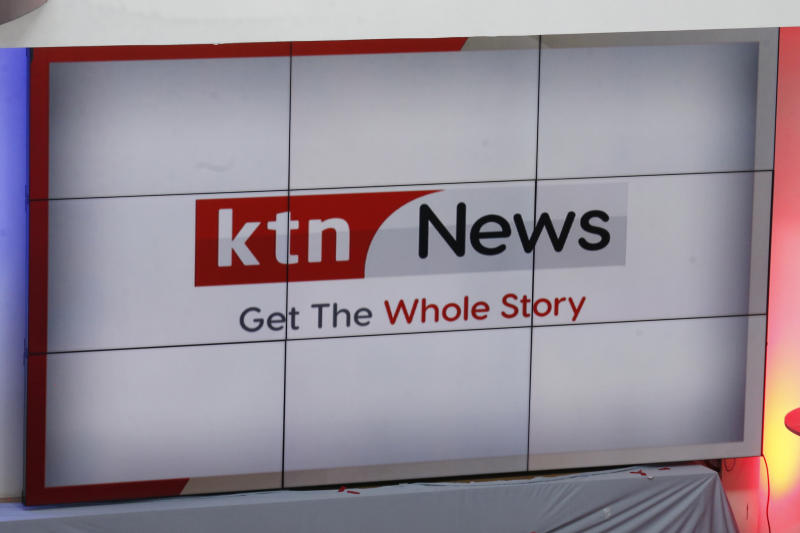
The new look KTN News logo during the official launch of the converged Newsroom and KTN News revamped studio at the Standard Group Headquarters along Mombasa Road in Nairobi on November 29, 2021. [Stafford Ondego, Standard]

The Standard Group PLC has been on a transformation journey that has led to the rebranding of key products. It started with The Standard and Standard Digital, and now, KTN News is undergoing this change.

KTN News has greatly evolved since it was launched six years ago as the first 24-hour news channel in Kenya. Millions of viewers remember with nostalgia some of the legendary programmes that took KTN News to the top, including Jicho Pevu, Inside Story and hard-hitting, exclusive interviews. We have been the voice of the voiceless through our news, and this has positively impacted lives in Kenya and beyond.

We are excited to unveil the results of a visual evolution that celebrates what we are becoming and the journalistic values that have helped make KTN News one of the most trusted brands and the number one 24-hour news channel in Kenya.

We put facts first because you come first. Our loyal viewers, readers and listeners, in these challenging times our world has changed and so have we.  

New station identity (new logo and look and feel)

The station identity involved reviewing the logo to ensure it speaks to the brand’s value of ‘Setting the standard in journalism to make the news count’, and changing the look and feel to bring in vibrancy.

The KTN News new logo has been simplified into a rectangular shape with strong square edges to reflect brand values, which are dominance, boldness, honesty, solidity and stability.

The logo is made up of two colour segments: one is red to symbolise passion, courage, excitement, youthfulness and boldness; the other is grey, which communicates neutrality, calmness and balance.

The word KTN appears in white on the red segment and is in lowercase. It is in Neo Sans Font, which is a strong, honest san-serif traditional font with modern square edges.

The word NEWS appears in black on the grey segment and is in upper and lowercase in Visby Round CF Font, which gives a soft, friendly and inviting feel.

The KTN News slogan remains the same and appears in dark grey and red, centralised below the logo.

So yes, it is true, we have said farewell to our red and blue logo, it served the purpose well and it was time we retired it.

New product offering

The revamped KTN News will have something for everyone. There are programmes for the youth and women; you can look forward to more investigative stories, deeper analyses in sports, business and health, and all-round shows that will impact lives.  

Brand promise

Trusting KTN News means trusting the people who present the news. Our journalists are passionate, bold, youthful and courageous. They are also neutral, truthful, calm and bring balance to a fiercely bipartisan world.

With unfiltered information, analyses that are thorough and truthful, and news that is accurate and full of substance, we are bringing you impactful journalism that changes lives.

At KTN News, we face facts, so we can own the facts and bring you news that counts.

The times have changed. And so have we. KTN News. Get The Whole Story.