The philosophy and thought behind our new design

Loading Article...

For the best experience, please enable JavaScript in your browser settings.

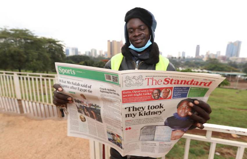
Cosmas Angaga, a bodaboda operator reads rebranded Standard Newspaper at Uhuru Park, Nairobi on April 9, 2021. [Denish Ochieng, Standard]

The new design was done by Einhorn Solutions an award-winning media design company based in Berlin, Germany.

The choice of the masthead (the title banner) was to deliberately empower The Standard brands. Though distinct, we appreciate that the mastheads must speak one language to our readers and consumers. This is complemented by the section openers that form part of the newspaper navigation.

The aim of the new design was to appeal to our readers in a time when the traditional print media is facing real threats from substitutes like the smartphone, computers, TV, and radio.

And because of that, the new newspaper imitates in many ways the other forms of news dissemination channels and at best offers a smooth transition to these others platforms. The distinguishing features include a modern, clean approachable design that is neither too elitist nor pretentious; comprehensive and easy to navigate, and a structured and organized layout. That is capped by a neat, concise and targeted look and feel.

We believe that all these features will delight our readers while they get informed, educated, and entertained on our pages. Moreover, the design is flexible on the weekends and in magazines where you have longer, well researched, in-depth articles.

Additionally, our website www.standardmedia.co.ke has undergone a similar make-over to give our online readers a similar exciting experience. A consumer of our online content will have a similar experience with those consuming our print products.

The signet or the emblem with the two lions was inspired by the Coat of Arms. The designers together with the editors were seized of the critical role media plays in our society; that of a public watchdog, which by all means is a patriotic duty. The signet has many elements- the lion symbolizes courage and strength. The Standard prides itself as Kenya’s boldest newspaper. The year 1902 is a celebration of our 119 years of exemplary journalism; the globe denotes our role of bringing the world (news) to our readers/consumers through news on our various platforms.

What is the philosophy of the colours? There are many sections of the new newspaper each with distinct colour signage. The colours chosen powerful, fresh, young, emotional colours but with red- the brand colour standing out and connecting seamlessly to the rest.

Why does the design emphasize on big images? The philosophy of the design is centred around hierarchy and proportion; big is big and small is small. When a reader opens a page, there should be no doubt which is the main story and which is the main image.

The design simulates how the eye lands on a page and moves around before exiting. So big topics and therefore lead stories on the pages will need such story-telling techniques like big images, quotes, numbers/statistics and infographics.

Lastly, but not least, there are distinct photos/images for each editions- the Daily (Monday-Friday) will be news-like and not symbolic while the Saturday and Sunday edition will have more symbolic imagery and semi-cryptic.