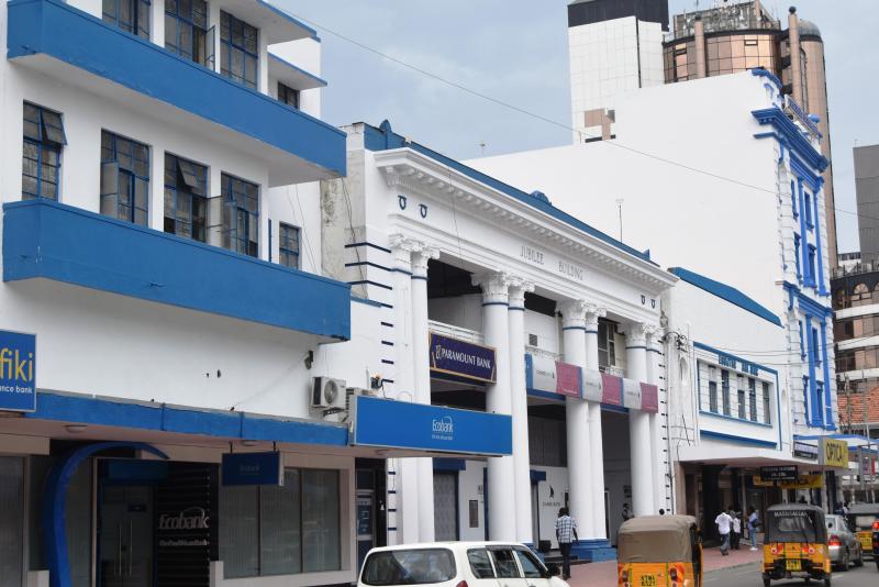
Although a new building may look elegant, a splash of colour goes a long way in attracting the right clients. Colour strikes a person’s psychology nerve. Colours like white, blue and green are reserved for hospitals.
Restaurants, market places and food outlets favour red and white. The Kenyan prison system favours green and black as they are considered cool and represent security and balance.
Most architects prefer white, brown and grey for painting the exterior of a building. Here is how colour psychology works in different situations in the built-environment:
Colour and tenants
David Murithi of Fanaka Real Estate says dull colours make buildings appear smaller. He says the colour of a building determines whether it will attract people or not. He says buyers avoid houses that are painted badly or painted in “weird colours”.
For example, he says, a house painted in bright red would be turned down compared to one painted in grey. He says most architects favour white, grey or brown because they stand out and appear bigger.
“These colours also make it easier to clean and maintain the building. I would advise a client to change the colour of a building if it’s not attractive. This will increase its demand, price, and the profit margin,” he says, adding that a building’s colour also dictates the culture of an area, with rural dwellers preferring houses painted in dull colours unlike those in urban areas who prefer brighter colours.
Colour and space
Emma Miloyo, the president of Architectural Association of Kenya, says when it comes to building architecture, some people consider colour to be a mere element of decoration, but in truth colour plays an important role.
She says lighter shades make space appear bigger while a darker shade makes the same space appear smaller. Colour also adds ambience to space.
Colour and advertising
Ivy Ng’endo, a shop owner in the Nairobi central business district, says: “I think the only role colour plays in a building is advertising.” Ng’endo gives the example of the World Business Centre, which she says gives the impression of an expensive building due to its glass facade.
“When I think of such a location, I would not think of putting up a mobile accessories shop in the premises because the glass looks so sophisticated. Most people would not shop there because it gives the impression that whatever is sold there is expensive,” she says.
She made changes to her shop when she rented it: “I painted it white, put LED lights and added some shelves with a splash of colours. The other traders with accessory shops started feeling insecure because my shop now looked more attractive and attracted more customers.” Ivy prefers white and blue for her M-Pesa and mobile accessories shop. “White gives a feeling of openness and purity and blue gives a sense of seriousness. I’m dealing with money and so I feel like blue is calm and it gives a feeling of security, friendliness, and trustworthiness,” she says.
Stay informed. Subscribe to our newsletter