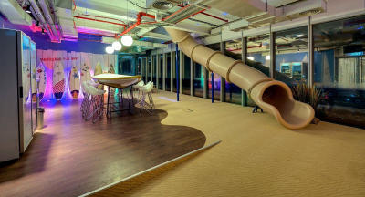
Google is known for not being afraid to experiment with its highly stylised, playful offices, but its newly opened local headquarters spanning seven floors of a Tel Aviv high-rise takes the cake for meshing high-concept design with relevant, useful space. |
Kenya: Every year, Inc magazine lists some of the world’s best offices. They comprise some of the world’s most inspiring, spectacular, and just straight-up useful office spaces built within the last three years.
These office areas are sophisticated, thoughtfully designed spaces that point to the future.
Beats Electronics: Playing with colours
Recently acquired by Apple from co-owners and showbiz icons, Dr Dre and Jim Iovine, Beats Electronics’ architectural design’s main aim was to leave behind the ‘fun and games’ of Southern California corporate architecture.
Jimmy Iovine, Beats’ co-founder, did not like the reclaimed wood and industrial steel aesthetic that is very popular in California’s creative and media offices these days.
The architects showed him samples of this and he immediately said: “This is NOT Beats!” As the architects tried to figure out what was Beats, the general consensus was to use an open workspace approach, open desks where possible and very few private offices.
The bright splashes of blue, turquoise and red used all over the building are a nod to the company’s saturated colour branding.
The different colour décor used in the office creates distinct locations and atmospheres.
Hallways of the office are lined with meeting or relaxation areas.
Despite these splashes of colour, vibrant hues don’t dominate the Beats office space.
Instead, they are reserved for small offices, conference rooms, and meeting areas. The main spaces are white with brass highlights.
The main space has a mirrored stainless wall.
It is intentionally almost a museum-like space, with a wood floor, and a massive open stairs.
Google Tel Aviv: Honouring cultural identity
Google is known for not being afraid to experiment with its highly-stylised, playful offices, but its newly-opened local headquarters, spanning seven floors of a Tel Aviv highrise, takes the cake for meshing high-concept design with relevant, useful space.
Stay informed. Subscribe to our newsletter
As a starting point, architectural firm Camenzind Evolution interviewed Google employees in Israel about their identity as a company and a culture.
The firm came up with an array of themes including family, optimism and heritage. Camenzind then decided to devote a floor to expressing each of these subjects.
“We went to the second-hand market to buy objects for the heritage floor,” says Stefan Camenzind, partner and executive director of the firm, which created the space alongside two other architectural firms.
The heritage floor looks like an antique shop with items such as patterned mirrors, traditional stools, tables and cabinets that characterised historical Israeli decor.
In interviews and steering groups, the Tel Aviv Googlers suggested a strong emphasis on communal space rather than personal office space.
This prompted the architects to build a series of small, compact workstations through parts of the building, complemented by elaborate, extremely varied collaboration spaces.
Common space in the form of communications rooms, cafes, conference rooms and other spaces for communal work make up about 50 per cent of the office’s floor plan.
The decor of the common work spaces in Tel Aviv is extremely varied to give employees the ability to put themselves in different work environments.
A slide in place of the conventional staircase or lifts leads to the snack bar on the lower floor and makes for an interesting transport medium.
The wow factor of the Tel Aviv office, however, is the indoor orange grove garden which is basically a garden consisting of small cultivated wood plants without undergrowth.
This space, which is also a common working area, influences the workers’ mood due to the green and relaxing environment as well as providing support for creative thinking and doing real work.
Coca-Cola: Historical elegance
Its core product may be more than a century old, but Coca-Cola’s new London office feels both fresh and historic infused with a bit of sentimentality. Covering more than 66,000 square feet, the building includes open-plan offices, flexible ‘hot’ desks, a cafe, a terrace and meeting rooms. The office is set in a retrofitted 1920s building, which is refitted throughout the building.
The designers used vintage paraphernalia, including graphics, signage and packaging to decorate the five-storey interior.
The immediate wow is the lobby, which struck by a view of a 21-foot-high comet-shaped chandelier installation featuring more than 80,000 acrylic ‘ice chunks’, suspended on ultra-fine wires and illuminated by LEDs.
While not glaring, Coke’s branding is evident throughout its offices. Not only is fire-engine red at play on every floor, but a custom-built, double-sided display wall has also been installed over three floors to showcase the brand’s long heritage, including iconic original Coca-Cola memorabilia from its archives in the United States.
Part of the display wall also includes LED-lit sections made up of 5,000 recycled Coca-Cola bottles which extend the entire height of the building.
To make sure you see it, the staircase runs through the centre of the building alongside a wall of Coca-Cola memorabilia from the brand’s archives.
Red, the main colour of Coca-Cola’s iconic branding, is used for furniture and lighting fixtures throughout the interior. A patchwork of materials and patterns breaks up the floor surfaces.
Mojang: Creating your own expensive history
When Mojang, the company that makes Minecraft – a game about breaking and placing blocks – which was recently acquired by Microsoft, set out to create a new Stockholm headquarters in 2012, it also set out to win some awards.
It turned to BSK Architecture, which has the professionalism that Mojang sought.
With little corporate history to draw from (Mojang was a scrappy start-up formerly based in a humble apartment), BSK created its own story to inspire the office design.
Its starting point was a fictitious character named Sir Mojang. He was deemed urbane, British, handsome, and to have impeccable taste.
Once armed with a narrative, selecting furnishings became extremely important to BSK. The office is a potpourri of classic Victorian, men’s club influences.
They include large conference table in mahogany, waxed and polished 18 times, chocolate brown leather seats, blue checked carpet, a rustic flat-top treasure casket as a coffee table, a curved legged pool table with three club lights hanging on top of it and a large screen dark TV room with club lights all over and furnished with comfortable dark fabric seats.
Nasty Gal: Light touches for big impact
Nasty Gal, the Los Angeles-based clothing company, was growing fast and needed one massive headquarters to house its 200-plus employees. The new 50,000-square-foot offices are housed in three historic, connected downtown buildings.
The design by Bestor Architecture preserved many of the structures’ original architectural elements, such as concrete-clad cast trusses, exposed brick, steel windows, concrete columns, and marble flooring.
Throughout the sprawling headquarters, bridges and added mezzanines connect different work zones and open-meeting areas.
Hallways branch out from a central cafe era, leading to open, benched workstations and shared work spaces.
While the brickwork is original to the building, Bestor Architecture strategically added wood accents to draw focus, provide texture, and warm up the concrete surroundings
Overhauling the massive third-floor space across three buildings was a challenge, especially on a budget. A lot of attention was given to adding creativity to the necessities: furnishings and lighting.
Bestor used graphic patterns in the otherwise simple light fixtures. Being able to design the shapes differently gave flexibility and thus dynamism. According to Barbra Bestor, they give a sense of direction down the hallways.
Founder Sophia Amoruso, along with much of her team, is into sleek lines and bold accents, which are incorporated all over the office space. Owing to this, part of the office is used as a photo studio and occasionally for styling.
— www.inc.com